Domino’s Turns Up the “Mmm”: Inside the Sonic Cravemark Rebrand and Its Growth Ambition
Domino’s unveils a confident refresh anchored by a sonic “Cravemark,” aligning brighter visuals, packaging tiers, and cultural voice with a growth engine spanning new stores, delivery aggregators, and a swelling loyalty base.

A Confident Sonic Pivot
On “Wednesday, October 8,” Domino’s Pizza unveiled a comprehensive brand refresh—its first since “2012—or 2012 depending on source.” The update amplifies familiar assets while debuting a playful, audio-forward “Cravemark” that dramatizes the extended “mmm” in Domino’s. Executive Vice President and Global Chief Marketing Officer Kate Trumbull set the tone by calling it an offensive move: “Most companies rebrand themselves when they’re struggling, but after years of category‑defying growth, this refresh is about continuing to push to be the best version of ourselves.” That framing places craveability at the center of the brand’s daily touchpoints—from boxes to apps—through a simple, repeatable sonic cue. The refreshed identity leans brighter, bolder, and more sensorial, aiming to create an instinctive link between the name and the feeling of deliciousness. It is a balanced, nourishing approach to brand design: protect core equity, then heighten the sensory experience so it feels more immediate, more memorable, and more shareable. Analysis: The announcement positions Domino’s as building on strength, not repairing weakness, using a distinctive “mmm” mnemonic to deepen salience at every interaction.
Why Move Now?
The refresh arrives under Domino’s “Hungry for MORE” initiative, which already spans product innovation, operational upgrades, and new unit growth. Trumbull’s reasoning underscores urgency in evolution; she echoed that “There is risk… to doing nothing,” aligning the identity work with a broader mandate to keep momentum and avoid stasis. With more than a decade since the last major update, Domino’s is signaling continuity and forward motion in the same breath—preserving recognition while making that recognition feel more sensorially engaging. In practical terms, the system is designed to be brighter and bolder, so it registers quickly in fast-moving feeds and busy storefronts. It reads as a thoughtful calibration rather than a reinvention: take what people already love and lift it with a memorable, multi-sensory signature. The goal is balanced progress—keeping core ingredients intact while creating a more craveable experience that can travel across channels and cultures. Analysis: The move hedges against brand inertia, linking the identity refresh to an ongoing growth program rather than a short-term corrective.
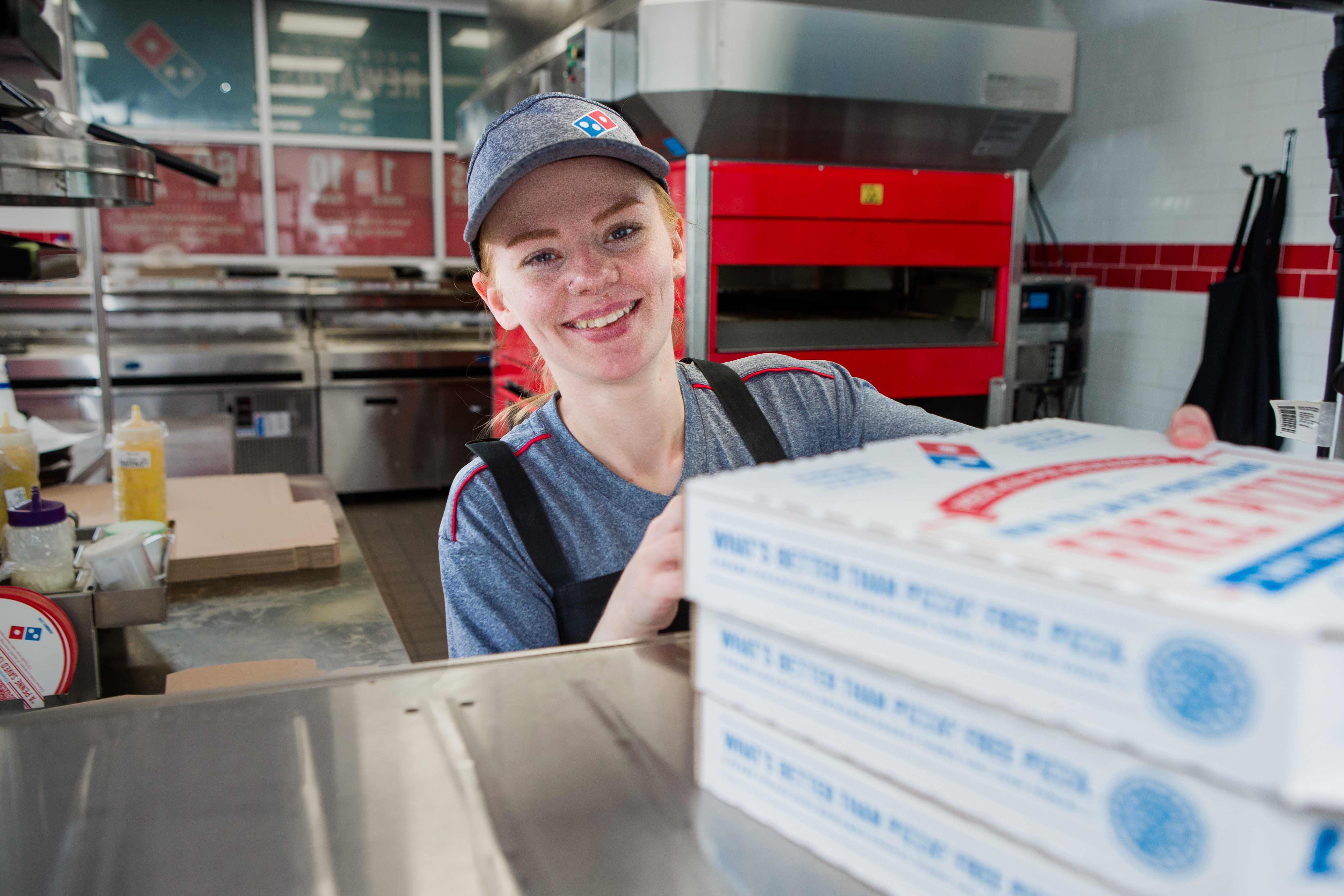
How the Cravemark Works
Domino’s has tightened and amplified its core assets. Colors shift to “hotter” red and blue tones, while a custom “Domino’s Sans” typeface is described as doughier and bolder. Logos are rendered more prominently across surfaces, ensuring faster recognition. Packaging introduces a clearer signal of tiering: signature boxes stay vibrant, while premium items such as Handmade Pan and Parmesan Stuffed Crust ship in sleek black and metallic gold wraps, a cue designed to telegraph quality and distinctiveness. The audio-first “Cravemark” is the system’s connective tissue. Expressed as “Dommmino’s,” the elongated middle leans into the instinctual pleasure of an extended “mmm.” Hip-hop and country-crossover artist Shaboozey brings this sonic device to life, sharpening memorability through a contemporary voice. Beyond packaging and ads, the update touches digital interfaces, team uniforms, and in-store graphics, with U.S. and international rollouts set to appear over the coming months. Analysis: A synchronized visual-and-sonic toolkit creates quick, cross-channel recall, enabling the “mmm” to move from boxes to apps to social clips with minimal translation.
A Voice Built to Travel
Cultural resonance is an explicit design choice. Shaboozey—a 30-year-old singer-songwriter with cross-genre appeal and charting tracks like “A Bar Song (Tipsy)” and “Good News”—animates the “Cravemark.” The selection nods to breadth and warmth: a voice with reach, but also a tone that can carry the craveable “mmm” across audiences and contexts. Agency WorkInProgress cofounder Matt Talbot frames the category fit succinctly, noting that pizza “transcends class, status and culture.” Within that framing, Domino’s pushes toward an inclusive mnemonic with wide cultural footing. The approach is not to replace familiar brand equity; it is to give that equity a fresh, resonant sound that invites recall. The result feels both playful and purposeful—an accessible signature designed to be consistent, contemporary, and easy to remember. Analysis: Pairing a broad-appeal artist with a universal food cue positions the “Cravemark” to scale across demographics without diluting the brand’s recognizable core.
Growth Metrics Behind the Bet
The timing aligns with tangible performance. Industry reporting cites a “5% sales gain in the first half of 2025,” with “revenues reaching $9.1 billion” and “over 21,500 global stores operating.” In 2024, U.S. retail sales rose “5.3%,” while international same-store sales extended a “31-year positive streak.” These figures suggest Domino’s is entering the refresh with revenue scale and a broad footprint already in motion. Under the “Hungry for MORE” banner, the company aims to “open roughly 175 new U.S. stores annually through 2028.” The brand is also available through aggregators—“DoorDash and Uber Eats”—and reports loyalty enhancements, with Domino’s Rewards membership rising by millions. The refreshed identity integrates with these growth vectors, offering a single, craveable thread that can weave across delivery, loyalty, and new store experiences. It’s a thoughtful way to harmonize a quickly expanding ecosystem. Analysis: The rebrand functions as a performance layer for a growth engine already accelerating—unifying expanding touchpoints with a simple, memorable cue.
Avoiding Rebrand Missteps
Domino’s appears intent on sidestepping rebrand pitfalls seen elsewhere. Other restaurant refreshes—for example, a controversial attempt by Cracker Barrel—are noted as cautionary tales. In response, Domino’s keeps its iconic elements intact: logo shape, heritage colors, and pizza identity remain central. The brand amplifies rather than discards, applying packaging innovations and updated digital interfaces alongside new uniforms and in-store graphics. By embedding the “Cravemark” in both sight and sound, Domino’s is crafting an emotionally textured cue designed for high-velocity digital environments. The system’s brighter visuals and sonic signature are calibrated for quick recognition in feeds while preserving hard-earned equity. It reads as a balanced approach—modernizing the sensory mix without severing familiarity, a nourishing evolution meant to invite existing fans and new guests alike. Analysis: The incremental-but-vivid strategy lowers the risk of alienating loyal customers while competing assertively for attention in a crowded QSR landscape.
What Remains Uncertain
Some details are still undefined. The rollout is described as unfolding over the “coming months,” but without specific phased milestones. While the company cites macro performance—“5% sales gain in the first half of 2025,” “revenues reaching $9.1 billion,” and a “5.3%” U.S. retail sales rise in 2024—the discrete impact of the rebrand itself is not isolated. The brand reports loyalty has increased by “millions,” yet no engagement breakdowns or order-share splits are provided. There are also minor inconsistencies and omissions in the announcement details: the year of “Wednesday, October 8” is not specified, and the timing of the last comprehensive refresh is referenced as “2012—or 2012 depending on source.” These gaps do not diminish the strategic intent, but they do set expectations: the clearest evidence of effectiveness will surface as sales, loyalty, and digital impression metrics accrue under the refreshed identity. Analysis: Key metrics tying outcomes to the identity work will emerge over time; the brand’s confidence is clear, even if precise attribution is yet to be quantified.
The Lesson in the “Mmm”
The rebrand operates as a performance layer atop Domino’s growth platform. Brighter visuals, a bold custom typeface, and the culturally tuned “Dommmino’s” mark are designed to intensify recall across every surface—from the box to the app to social feeds. Within “Hungry for MORE,” the identity aims to unify expansion plans—“roughly 175 new U.S. stores annually through 2028”—with aggregator availability on “DoorDash and Uber Eats” and a loyalty base expanding by millions. It is a confidence play that preserves classic equity while upgrading how the brand shows up in multi-sensory, contemporary contexts. The lesson is disciplined simplicity. By reinforcing a single, emotive habit loop—an elongated “mmm”—Domino’s builds a cue that is easy to remember, easy to repeat, and easy to scale. It’s a thoughtful blueprint for growth branding: create a balanced, nourishing system that respects what people already recognize, then sharpen it so the experience feels immediate and craveable in the moments that matter. In an increasingly digital marketplace, that kind of clarity can be its own competitive advantage. Analysis: The strategy differentiates through reinforcement, not reinvention—engineering a sensory signature to sustain momentum while honoring long-standing brand familiarity.