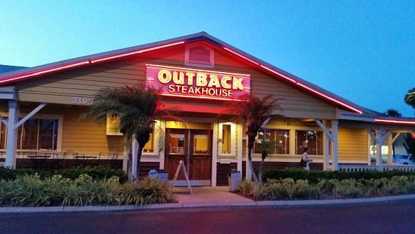
Photo by Jim Sosengphet on Unsplash
Popeyes x One Piece: Bold Anime Collab
Popeyes teams with One Piece for a limited menu and merch drop, blending bold flavors with anime fandom to boost traffic and loyalty.
Apr 16, 2026
Photo by Jim Sosengphet on Unsplash
Popeyes teams with One Piece for a limited menu and merch drop, blending bold flavors with anime fandom to boost traffic and loyalty.
Apr 16, 2026
Photo by dedy kurniawan on Unsplash
A close look at Jersey Mike’s rapid expansion, leadership shift, and international push under Blackstone’s ownership.
Apr 16, 2026
Photo by Roberto Catarinicchia on Unsplash
CAVA launches Glazed Salmon with pomegranate glaze from Just Date, pairing seafood with chef-curated bowls and a new loyalty push to broaden Mediterranean flavors.
Apr 15, 2026
Photo by Carol Highsmith's America on Unsplash
Chains fuse Korean, Mexican, and botanical flavors into familiar favorites. Discover the artistry, risks, and strategy behind this culinary renaissance.
Apr 15, 2026
Photo by on Unsplash
GoTo Foods bets on co-branding, digital muscle, and veteran leadership to add 1,400+ locations and reshape multi-brand franchising.
Apr 15, 2026
Photo by Nick Karvounis on Unsplash
Restaurants accelerate growth by treating digital not as a tool, but as a living product under constant optimization.
Apr 14, 2026
Photo by logan jeffrey on Unsplash
Chicken Salad Chick taps Brian Lindley as CDO, aiming for new markets and non-traditional growth. How will this gentle pivot shape the brand’s future?
Apr 14, 2026
This article explains how to evaluate a restaurant franchise by reviewing costs, control, risk, margins, and long-term ownership fit.
Apr 13, 2026
Learn how better QSR inventory control reduces waste, prevents stock-outs, improves food cost accuracy, and protects restaurant profit margins.
Apr 14, 2026
Rising costs test restaurant value as diners seek quality, portion fairness, and genuine experience. Discover the strategies reshaping hospitality.
Apr 13, 2026
Business analytics dashboards are an integral component for delivering important business metrics. Here are the best practices for implementing a BI dashboard in the workplace.

Businesses have never had as much access to big data as they do now, as the quantity of information available can be overwhelming unless there is a plan to manage and leverage it.
Data-driven management systems have allowed organizations to take advantage of the data at their disposal and use it to their advantage; business intelligence dashboards are an example of these systems.
If implemented properly, BI dashboards provide actionable insights that lead to better decision-making, improving operational efficiency, and increasing revenue. Here are some best practices for implementing and designing a BI dashboard.

A business dashboard is an information management tool that utilizes data visualizations to display key performance indicators, or quantifiable measures conveying a company's performance.
Users can assess company information by navigating through charts and graphs, which are displayed on a single screen. Dashboards can be customized according to the needs of the business, displaying metrics relevant to its industry.
Data visualizations allow users to easily conceptualize large data sets that may otherwise be confusing. User-friendly and personalized, dashboards measure market trends, operational efficiency, and customer purchasing patterns.
BI data dashboards are utilized to learn more about the intricacies behind day-to-day operations. Dashboard information informs the user of a particular topic in order to make decisions that lead to an overall improvement in business processes.

Primary benefits of utilizing this BI tool include
1. Identifying Trends
Business analytics dashboards are used to analyze and identify the market or financial-related trends that affect the well-being of the company. Armed with this information, decision-makers can then take the necessary to adapt to these trends.
2. Increased Efficiency
Dashboards are updated in real-time as new data enters the system. This data is used to make decisions that are based on the most accurate and relevant information. Efficiency improves when all parties are informed at the same time, eliminating the need for guesswork.
3. Interactive Data Visualization
Because humans process images at a much faster rate than words, graphics are an effective way to present information to users. Visualizations are designed to be interactive, providing users the chance to firmly understand specific sets of data.
4. Self-Service Elements
BI dashboards are built to be intuitive, user-friendly, and simple to navigate. Invaluable insights are available on a company-wide scale, even to those without good technical skills.
5. Freedom & Flexibility
Most business analytics dashboards have mobile integration capabilities, allowing users access to information regardless of their whereabouts. This flexibility contributes to increased operational efficiency because it is easier for everyone to stay updated at all times.
Some best practices to follow when implementing a dashboard include-
1. Identify Stakeholders & Reporting Requirements
List all stakeholders, decision-makers, and end-users that will be using the dashboard. Find out which business questions each of them needs answered, and decide how the dashboard may answer those questions.
Once a target audience is defined, it's easier to determine which KPIs to include on the dashboard. Pick KPIs that measure the process towards the goals determined by each stakeholder.
2. Know the Dashboards Available
Before selecting a BI tool, it's important to know the types of dashboards available. Here are the different types of dashboards
Once the business has determined which type of business analytics dashboard to use, it can focus on implementing an effective design. Best design practices include
Apply the Principle of Similarity
Put comparable dashboard elements next to each other on the dashboard. Similar colors, shapes, and fonts should be grouped to improve user readability.
Establish Endpoints & Closure
Dashboard elements should be close enough to each other so the user can find the information that is needed. At the same time, avoid putting elements too close together or the dashboard will appear cluttered.
Create Cohesiveness
Elements are easier to read when they are linearly connected. Eyes tend to look in a horizontal, rather than a vertical direction. Design elements in a linear fashion to improve readability.
Use Consistent Alignment
Put the most important information on the upper left-hand corner of the page, as that's where the eye tends to look first.
Make Use of White Space
White space or blank space gives the eye a breather, preventing sensory overload. At the same time, too much white space makes the dashboard look empty and dull.
Show Contrast
Experiment with color and white space together to find the most visually appealing contrast. Contrast can draw the viewer's attention to specific data or important dashboard elements.
Utilize Effective Visualizations
Some data visualizations are more useful than others depending on the type of data. For example, line charts and column charts are good at showing a change over a period of time because the eye naturally understands an upward or downward linear direction.