
Dave Shula Returns as President of Shula's Restaurant Group
Dave Shula rejoins Shula's Restaurant Group as president, leading growth into Palm Beach Gardens and a 2027 Thomasville, Georgia expansion.
News
Sep 23, 2026
Dave Shula rejoins Shula's Restaurant Group as president, leading growth into Palm Beach Gardens and a 2027 Thomasville, Georgia expansion.
Sep 23, 2026

McDonald's commits $8.5 billion through 2036 to modernize restaurants, boost cash flow by $100,000 per store, and grow chicken and beverage sales.
Sep 23, 2026

WKS Restaurant Group promotes Jay Spongberg to president and COO after he helped grow the company from 65 to 382 restaurants over 16 years.
Sep 23, 2026

Smokey Mo's BBQ names Von Dawson, a Dine Brands veteran, as VP of Franchise Development to lead its Texas expansion strategy.
Sep 23, 2026
.png&w=3840&q=70)
Meritage Hospitality's Chapter 11 filing pulls 5% of Wendy's U.S. stores into bankruptcy, exposing cracks in franchising's bigger-is-safer bet.
Sep 21, 2026

Jack in the Box names Rachel Ruggeri to its board as Michael Murphy retires, amid a CEO transition and deal with investor GreenWood.
Sep 21, 2026

Restaurant inventory tracking helps owners monitor stock, control food costs, reduce waste, improve purchasing, and make informed operational decisions.
Sep 21, 2026
Improve restaurant Google Maps rankings by optimizing your business profile, selecting accurate categories, gathering reviews, adding photos, and strengthening local relevance signals.
Sep 21, 2026

Restaurant owners can significantly reduce restaurant costs by leveraging technology across inventory, labor, procurement, forecasting, and administrative operations for better profit margins.
Sep 18, 2026

Understand how to forecast restaurant revenue and expenses with methods for sales projection, cost scaling, fixed-cost planning, and risk buffering.
Sep 18, 2026

Unlock Exclusive Access To Webinars, Events, And The Latest News For Free!
Business analytics dashboards are an integral component for delivering important business metrics. Here are the best practices for implementing a BI dashboard in the workplace.

Businesses have never had as much access to big data as they do now, as the quantity of information available can be overwhelming unless there is a plan to manage and leverage it. Data-driven management systems have allowed organizations to take advantage of the data at their disposal and use it to their advantage; business intelligence dashboards are an example of these systems. If implemented properly, BI dashboards provide actionable insights that lead to better decision-making, improving operational efficiency, and increasing revenue. Here are some best practices for implementing and designing a BI dashboard.
A business dashboard is an information management tool that utilizes data visualizations to display key performance indicators, or quantifiable measures conveying a company's performance. Users can assess company information by navigating through charts and graphs, which are displayed on a single screen. Dashboards can be customized according to the needs of the business, displaying metrics relevant to its industry. Data visualizations allow users to easily conceptualize large data sets that may otherwise be confusing. User-friendly and personalized, dashboards measure market trends, operational efficiency, and customer purchasing patterns. BI data dashboards are utilized to learn more about the intricacies behind day-to-day operations. Dashboard information informs the user of a particular topic in order to make decisions that lead to an overall improvement in business processes.
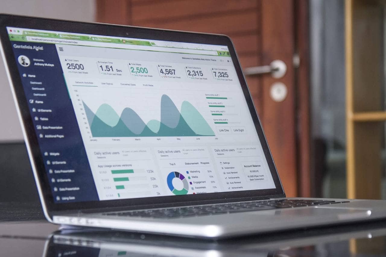
Primary benefits of utilizing this BI tool include 1. Identifying Trends Business analytics dashboards are used to analyze and identify the market or financial-related trends that affect the well-being of the company. Armed with this information, decision-makers can then take the necessary to adapt to these trends. 2. Increased Efficiency Dashboards are updated in real-time as new data enters the system. This data is used to make decisions that are based on the most accurate and relevant information. Efficiency improves when all parties are informed at the same time, eliminating the need for guesswork. 3. Interactive Data Visualization Because humans process images at a much faster rate than words, graphics are an effective way to present information to users. Visualizations are designed to be interactive, providing users the chance to firmly understand specific sets of data. 4. Self-Service Elements BI dashboards are built to be intuitive, user-friendly, and simple to navigate. Invaluable insights are available on a company-wide scale, even to those without good technical skills. 5. Freedom & Flexibility Most business analytics dashboards have mobile integration capabilities, allowing users access to information regardless of their whereabouts. This flexibility contributes to increased operational efficiency because it is easier for everyone to stay updated at all times.

Some best practices to follow when implementing a dashboard include- 1. Identify Stakeholders & Reporting Requirements List all stakeholders, decision-makers, and end-users that will be using the dashboard. Find out which business questions each of them needs answered, and decide how the dashboard may answer those questions. Once a target audience is defined, it's easier to determine which KPIs to include on the dashboard. Pick KPIs that measure the process towards the goals determined by each stakeholder. 2. Know the Dashboards Available Before selecting a BI tool, it's important to know the types of dashboards available. Here are the different types of dashboards
Once the business has determined which type of business analytics dashboard to use, it can focus on implementing an effective design. Best design practices include Apply the Principle of Similarity Put comparable dashboard elements next to each other on the dashboard. Similar colors, shapes, and fonts should be grouped to improve user readability. Establish Endpoints & Closure Dashboard elements should be close enough to each other so the user can find the information that is needed. At the same time, avoid putting elements too close together or the dashboard will appear cluttered. Create Cohesiveness Elements are easier to read when they are linearly connected. Eyes tend to look in a horizontal, rather than a vertical direction. Design elements in a linear fashion to improve readability. Use Consistent Alignment Put the most important information on the upper left-hand corner of the page, as that's where the eye tends to look first. Make Use of White Space White space or blank space gives the eye a breather, preventing sensory overload. At the same time, too much white space makes the dashboard look empty and dull. Show Contrast Experiment with color and white space together to find the most visually appealing contrast. Contrast can draw the viewer's attention to specific data or important dashboard elements. Utilize Effective Visualizations Some data visualizations are more useful than others depending on the type of data. For example, line charts and column charts are good at showing a change over a period of time because the eye naturally understands an upward or downward linear direction.